

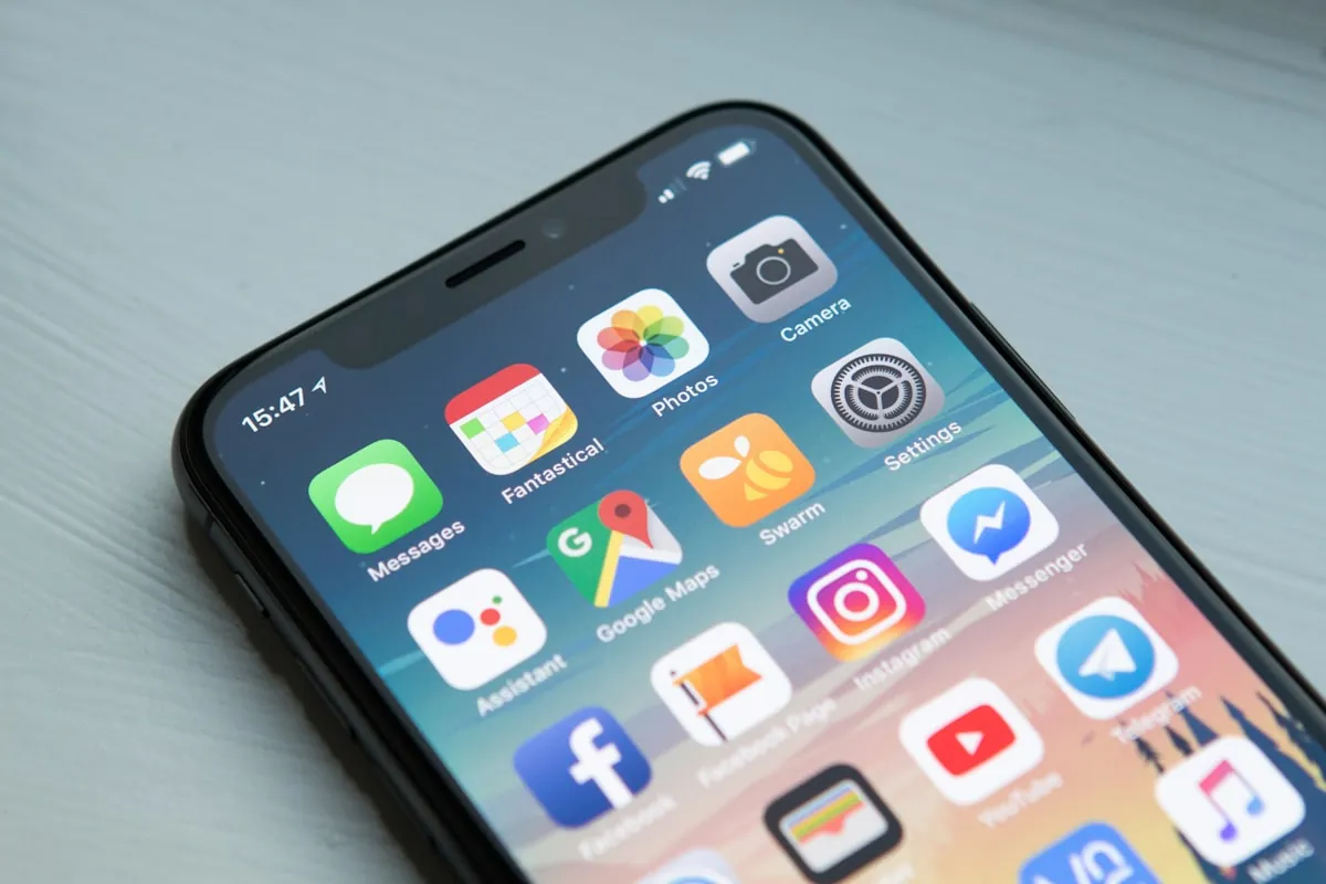
Over 60% of all web traffic now comes from mobile devices. For small businesses, that statistic is more than a number. It reflects how your customers find you, browse your services, and decide whether to reach out. If your website is not optimized for mobile, you are missing opportunities every single day.
A mobile-first approach means designing your website for smaller screens first, then scaling up to desktop. This is not the same as making your existing site shrink to fit a phone screen. True mobile-first design rethinks layout, navigation, content hierarchy, and performance from the ground up with mobile users in mind.
Why Mobile-First Matters for Small Businesses
Your customers are searching on their phones. Whether someone is looking for a web design company in Coeur d’Alene or checking your business hours while driving, the experience they get on their phone shapes their first impression. A site that loads slowly, requires pinching and zooming, or hides your contact information will send visitors straight to a competitor.
Google also prioritizes mobile-friendly sites in search results. The company switched to mobile-first indexing several years ago, meaning Google primarily uses the mobile version of your site to determine rankings. If your mobile experience is poor, your local search visibility suffers directly.
Core Elements of Mobile-First Design
Fast Loading Times
Mobile users expect pages to load in under three seconds. Every additional second of load time increases bounce rates significantly. Compress images, minimize JavaScript, and use caching plugins to keep your site snappy. We covered why website speed matters in detail, and it is even more critical on mobile connections.
Thumb-Friendly Navigation
Desktop users have a mouse. Mobile users have their thumbs. Menus, buttons, and links should be large enough to tap easily and placed where thumbs naturally rest. Avoid hover-only interactions that do not work on touchscreens. A hamburger menu or bottom navigation bar works well for most small business sites.
Readable Content Without Zooming
Text should be at least 16 pixels on mobile. Line lengths should be short enough that users do not have to scroll horizontally. Break long paragraphs into shorter chunks and use clear headings that let people scan quickly. Your content should work just as well during a quick lunch break as it does during a scheduled appointment.
Clear Calls to Action
Your phone number, contact form, and booking button must be easy to find and tap on a small screen. A sticky call-to-action button at the bottom of the screen that follows the user as they scroll can dramatically increase conversions. Make it obvious what you want visitors to do next.
Common Mobile Design Mistakes
Using a Desktop-First Framework and Shrinking It
Many website builders and themes advertise as responsive but actually start with a desktop layout and squeeze it down. This approach can leave you with tiny text, cramped navigation, and hidden features on mobile. A truly mobile-first theme or custom build starts with the phone layout and adds desktop features as the screen grows.
Popups That Cover the Screen
Full-screen popups that are frustrating on desktop are downright unusable on mobile. If you use email signup forms or promotional overlays, make sure they appear in a way that is easy to dismiss on a small screen. Google penalizes sites with intrusive interstitials on mobile.
Ignoring Touch Targets
Links and buttons that are too close together lead to accidental taps. The recommended minimum touch target size is 48 by 48 pixels. Check your site by navigating it on an actual phone, not just by resizing your browser window.
How Mobile-First Design Connects to SEO
A mobile-friendly site is a foundation for good SEO, but it is not the only factor. Your site also needs proper local business schema, consistent name-address-phone information, and an active Google Business Profile. Mobile-first design works together with other best practices to help customers find you. For a deeper look at how search optimization works for small businesses, see our guide to professional websites in the AI search age.
Getting Started with Mobile-First Design
If your current website was built more than two or three years ago, it likely was not built with mobile-first principles. A redesign that prioritizes mobile users does not have to mean starting from scratch. A professional web designer can audit your current site, identify the worst mobile issues, and make targeted improvements. In many cases, switching to a mobile-first WordPress theme with proper customization gives you a strong foundation without rebuilding your entire content library.
Make Mobile Your Priority
Mobile-first web design is not a trend. It has been the standard for years, and the gap between mobile-friendly and mobile-unfriendly sites only grows wider. If your site is hard to use on a phone, you are invisible to a majority of potential customers. Start with the mobile experience, and your customers (and your search rankings) will thank you.
Ready to make your website work for every visitor? Contact us to discuss a mobile-first approach for your small business site.